Showing posts with label Scribbles. Show all posts

Thursday, February 25, 2010

Sofa Waiting

Last night I finally bought a sofa. I'm waiting for it to be delivered. I've been wanting to since we got our condo, and have been suffering through using two of the ugliest sofas known to man that were hand-me-downs. I say "suffering" with some sarcasm because I do realize having two hand-me-down sofas isn't really suffering at all. But the second one really, really offended my aesthetics. Even when I put a giant brown slipcover on it, I could still see those damn rolled armrests. So today I wait for new sofa delivery. It's orange.

Purchasing a sofa has been no small feat. I'm pretty clear on what I like and dislike and with my budget it has been nearly impossible to find anything other than terrible things like this:


Look. I realize that this isn't the most offensive sofa ever made. In fact, it's pretty good compared to most of the stuff at the Brick or Leons or Bad Boy. But see those puffy rolled arms? This is totally what people call 'contemporary'. UGH.

I can't think of any thing I like less than what people commonly call "contemporary" decor. It is what people do to their homes when they think they are being fashion forward and stylish. This would go in a house with a lot of beige and maybe one of those brownish red walls randomly painted in the middle of the house. It goes with dark wood and virtually everything in the Zellers Martha Stewart home collection. Safe. But somehow people think this is a 'designer' look. It isn't. It is a mass market look. I know I'm not like most people in this regard. But it can still irritate the shit out of me, right?

Why I take offense to this whole look is that to me it is simply uninspired. It isn't thoughtful or creative or well designed. It is just what is "in". Red is in = red sofa. I admire those who can buy mainstream things and feel like they've really updated their look. But I have bad news for these people. Your stuff isn't going to look contemporary or 'new' in 10 years. It is going to look like it was purchased in 2008. Just like this; which was once called contemporary and looks like it was designed somewhere between 1988 and 1991:


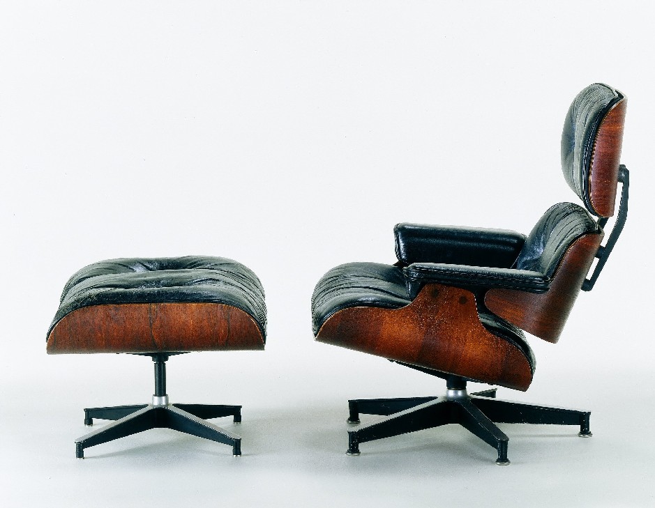
I'm not trying to be some sort of design snob, I'm really not. I simply wish people were more original. I want us to catch up with european design taste that has existed for decade upon decade. We north americans have been so slow to adopt a modern look, it just came and went in the 50s and didn't stick around or get improved upon at all. In the 80s, there was an attempt, but it failed miserably (because it was badly executed) and so people went running back to nostalgic looks. Like those brand new subdivisions that look like the victorian era puked all over them. Like sofas that look like they are designed for the Pope to sit on them with doilies and toile and gold threads woven through. Like "country" blue and little white geese in the early 90s. How did we go from Eames chairs to little white geese? What happened?

Outside of Ikea and the relatively-new Urban Barn, where do we Canucks have to shop for unique and relatively affordable furniture? Sure sure there's upscale design stores and small boutiques in the big cities. But you know what? I can't afford a $4000 sofa. But is there nothing betwixt the $4000 designer item and the $799 Brick special? Does my budget mean I must suffer through bad design? Isn't the Brick or Leon's capable of selling furniture with unique features? Different styles? I'm serious when I say there wasn't one sofa at any of the big box furniture stores that I would even consider dropping a grand on. My ugly slip covered sofa was better. The thing is, people don't care about good design. They want cheap, comfortable furniture that fits their idea of what is currently fashionable.

But it wasn't always like this. This is a symptom of the mass market world we now live in. Nothing is purchased by retailers in small quantities. This is really the global marketplace taking away our choice. In the case of something like books, mass marketers take away our array of choices, but it is ok, because they give them back on the internet and include free shipping. But in the case of large items like furniture, the choice is taken away and not well replaced by the internet. (Ever looked into the cost of shipping a sofa from LA?) At one time you might have had a miriad of sofa choices in a wide selections of fabrics to choose from, and the option of customizing your choice for your space, all this made possible because the stuff was produced locally. You now have only the top 20 designs in one colour made in China and shipped in massive containers of only that one design (afterall buying huge quanitites of the same thing keeps prices low). 

Furthermore your sofa doesn't have any shelf life. The design is going to go out of style, but likely no faster than the couch itself will disintigrate into nothingness. No products are made to be permanent anymore. Everything is disposable.

Because everything is disposable (I'm looking at you, 5 year old dvd player on last legs) these days, it doesn't matter if the style is 'classic' or 'timeless' or 'well designed'. Because the retailer is counting on you buying a brand new one within 10 years anyhow. Following the herd to the new trendy look, colour or style.

Furniture that is unique and well designed should last a lifetime. It should appear timeless. You shouldn't look at it and think "wow that reminds me of a boy-girl party I went to in grade 7". This is why stylish people with taste all over america are frothing at the mouth to get their hands on mid-century modern design. It is still fashionable and stylish after all these years because when people made the products, they were making them to last a lifetime. Not a decade.

I'm not saying I have the most timeless style ever or something, I just want to have more options available to me. At this point, some of my best items have been finds at garage sales and thrift stores, where people don't have good taste, or at least, they don't know as well as me what something could be worth. Like the two wooden lamps I bought this week, likely circa 1960, with original shades for $15 on kijiijii. Those lamps placed in a decor store on Queen street would have fetched ten times that because the people selling them would appreciate that 1. they are classic, 2. they are original  and 3. they can't be replaced.

There, I just identified them: Those are the three points missing from all contemporary furniture. 1, it isn't classic and has a short shelf life. 2. it isn't original at all and 3 they can be easily and affordably replaced.

I've never really seen lamps like I just bought in a store in my lifetime. But I've seen at least 3000 variations of this lamp:

 I'm honestly not even going to bother to figure out who was the designer that brought these clear based lamps into style because I don't care. It's now been ripped off so many times that it doesn't matter anymore. And I think this is because corporations are so scared of taking risks. They just want safe. They want results for shareholders. They reproduce this in a watered down version. They'd rather rip off every design in their catalog to ensure it is "safe" and has lots of "turns" (product management speak for how many times the stock turns over in the warehouse) so they can make the most money possible every year.

One of the first companies in the US to really begin selling modern furniture, Design Within Reach, has been falling apart recently, because instead of continuing to sell designer furniture like Knoll orignals such as Eames chairs and Barcelona Chairs,  they decided to start selling their own crappy versions of these. Essentially watered down cheap mass market knock offs of the originals. Because they wanted to improve their bottom line. There's a great article about that mess in a recent Fast Company issue, if you want to read more.

Why are we north americans so obsessed with fast and cheap? I wonder if it is because our countries are so young, so new that we can't imagine the future. European nations have this perspective on time, because they are filled with buildings thousands of years old. They see that things change, but not really. They appreciate timeless quality and good design because they are well aware that those 'things' could be around for many lifetimes. At least this is my theory. We don't have any perspective on that. Which is perhaps why we continue to recycle 'victorian' over and over again. We keep seeing victorian buildings as 'old' and there is some sort of nostalgic attachment to that style, so we keep recycling it.

People seem to think modern is always cold and minimal. Not so. This was recently confirmed for me by this little home decor style quiz I did that was shockingly accurate. Also for my mom, and another person I know who took the quiz. Try it out and see if it works for you. I got "earthy modern". Which couldn't be more true. I like modern looks, especially mid-century things, and I love warm colours in my decor. I want it to be comfortable and pleasant. I want lots of natural woods and original finishes. Hand made things. I don't want rolled arms and tufted things and anything that looks like it was designed before the first world war. And I want it to be well designed. So I must say, the quiz's placement of my style was bang on. I felt it was so bang on in fact, that I celebrated by purchasing my orange modern sofa.

Oh! My sofa just arrived. Must go lounge.


Thursday, February 18, 2010

Blogroll

I added a list of blogs I read, and blog friends to my blog. Not sure why I waited so long. Anyhow. There it is. I'll add to it but I'm trying to keep it at a reasonable length because who will actually go through all of them? No one. There's lots I read that didn't make the cut. But if you can't find Goths in Hot Weather on your own, that's your problem.

Ok, so there's 16. Lets say I'll go to 20 before I start bumping. So act fast. HA.

Anyhow thanks to the lovely Hungry & Hammered for introducing me to Bad Sandwich Chronicles. So good and a new favourite.

I've included a few design blogs, a music blog, some randoms, and etc. Enjoy.

Cobrapants


It's been a while.

No, I'm not singing along to a Britney Spears song, though that wouldn't be unusual, would it. Nope, I'm referring to how long it has been since I've posted some rant about some societal bullshit that has pissed me off. It's not for lack of pissed-offed-ness, but for lack of time and energy.

Ah well, I know I'll get around to it at some point. Maybe after the Olympic Men's Figure Skating champion is crowned. I find that whole kaboodle quite distracting.

Meantime check out Cobrapants, my new favourite music blog. I love it so hard. Especially cause there's free music! Love free music. LOVE.

Complete with downloadable dj mixes that make my life livable. My commuting life, in particular. Yes, that's me, rocking out in my car, TOTALLY HARD. You shoulder dance? That's weak. I want to see you thread the needle while travelling 120km an hour, then you can talk to me about car dancing, ok?

Check it out. This post has an excellent mixtape.

Friday, January 29, 2010

Illustrator of the Month - January


I almost missed this month's entry. It has been insane, with work travels to Atlanta and LA, and that on top of this being my busiest month of the year at work. Doubly this year, since I seem to keep inheriting the title "project lead" on shit, which is just that, shit, because it means somehow you are responsible and trusted by your employer, it also means you are responsible for and supervise everyone else's work fuckery. Suddenly their procrastination becomes your problem. It is lucky that Christmas falls when it does, because otherwise I don't think I'd survive. I think I might be the only person who looks forward to February each year.

This month the artist came to my attention reading Juxtapoz magaine on the airplane. One of the perks about travelling for work is that I can expense my reading material for the plane, and this time I picked my regular as well as Juxtapoz, for a change. Other work trip perks include staying in cool hotels and drinking premium alcohol for free on work nights. Not only expected, but encouraged. This is fine by me, but I have got to stop making 8am presentations hung over.

Juxtapoz is excellent - art without stuffiness and pretention, but still real articles on the topic. More articles than advertising, that is always a treat to see. Their cover artist on the January 2010 issue is Kehinde Wiley.

Kehinde Wiley is a painter. His style is something different for me, not something I would normally pick as a love. But, after finishing the magazine, I kept coming back to the pages with his images over and over again. I keep thinking about the meaning behind them. I am enamoured with his ability to freehand paint patterns. No digital cheating here folks. Saying that makes it sound like making digital patterns this complex is easy. Well, it isn't, but it is damn easier than doing it by hand.


He paints portraits of youth - primarily African American, sometimes of other cultures or races, but always the underserved male youth. He places his subjects in settings that will feel familiar to you if you study art history - history at all really, as he places them in typical poses from early 19th century portraiture or Renaissance portraiture.

Those grand, proud poses.

The work is so engaging because the artist is clearly a master - his attention to detail, the style, the painterly strokes. But it is also totally current - relevant to today's youth culture and yet is haunting because of the oddness of the pairing of these two eras.


I find his work compelling because of this contrast, but also because I feel the artist is also commenting on white arrogance. There is, among a certain generation, or personality, in white folks, the inclination to find offense in black arrogance. Personally I find arrogance refreshing, I find confident people the most interesting. But I am specifically thinking of my (or your) parents "not getting" rappers braggadocio - or the "controversy" regarding Usain Bolt's "arrogance" at the last Olympics. That sort of thing. That sort of racist thing.


Because somehow, despite the oddity of this portraiture, people still hold it in very high regard. And likely wouldn't question the confident nature of the subject.


Aside from all that thinking hard stuff, his images are really cool to look at. Juxtapoz has nice full page reproductions.


Kehinde Wiley is also gay. Maybe this shouldn't be mentioned in this post, but it seems significant to his work to me. Should I mention it? I did. 

Accepted in the hip hop community, Kehinde was comissioned to do a number of portraits for the hip hop honours. Hip hop & gay don't usually ...typically go together, so that is pretty interesting. And good.


Thursday, January 14, 2010

Poster Boy

Poster Boy is a New York city area street artist, who uses only a razor. He cuts sections out of posters on the street, and rearranges them. Some of them are so, so good. Check out his flickr to keep up with recent work.


Wednesday, December 16, 2009

Illustrator of the Month - December

I first saw the work of Angelina Wrona at a trade show. Gliclee prints on canvas of her work are now available to the mass market...but they wouldn't let me buy a show sample for wholesale. Meanies. Rule Followers. Hrumph. Guess I'll have to suck it up and order one, or find it at retail.

This is the one I wanted:


Wouldn't she be lovely in my powder room? I thought so.

Wrona blends Japanese Anime, folk art and representational styles and combines delicate, dark subjects with surreal twists and ideas. This collection of images is referred to as her 'Senta-Mental' dolls, as each one seems to live in a fairy-tale world, a world that is imagined and brought to life in the artist's Merrickville, Ontario home.

Wrona is having a show of new work beginning Sunday December 20th, 2009 at the Off the Wall Gallery in Toronto, Ontario. The gallery is at 450 Queen St. W.


Wednesday, December 9, 2009

Thursday, November 19, 2009

Richard Kern


I briefly mentioned Richard Kern in my last post, and I thought I'd share some more Kern images for fun.

I first heard of Kern when he directed the Marilyn Manson video "Lunchbox", I was such a loyal little fan!  The good old days, when Marilyn Manson was still a good band. Aw, just listening to this song in the background while typing this gives me warm fuzzy feelings. Really.

Kern is primarily a portrait artist, though he dabbles in video direction and pornography. One might argue that any nude portrait is pornography, I would argue the opposite, and that's why I say he dabbles in pornography. Usually the subjects are just nude.

I think that Kern's portraiture possesses a unique vision that serves to express the human connection between himself and his subject, while recording subtle moments in cultural history. It is the voyeur in the artist's spirit that captures the subject in a portrait, while it is narcissism or a lack of objectivity that keeps that view out of self portraits. Not to say that one is better than the other, but it is interesting to see the way two portrait artists might capture the same individual in such different ways that the person may be unrecognizable between portraits. Somehow, the self portrait lacks this quality and ability - we as artists tend to capture only the self we wish to see.


He is part of a wave of artists (and average folk alike) that are taking nude photography out of studios and shady development labs into the mainstream home. The digital era has changed pornography and therefore our depictions of perversion; we can now find "anything" but also create "anything" we can imagine. An artist like Kern seeks to find new and dynamic ways of exploring these expressions that allows the viewer to think differently about sexual diversity, while maintaining his artistic credibility. These are not simply nudes for the sake of sexuality, perhaps the sexuality exists within the model, and Kern captures it, or it is projected by the viewer.


Wednesday, October 28, 2009

Illustrator of the Month October


Chelsea Groves lives outside of San Franscisco. She graduated from the University of South Carolina in 2003 with a degree in Art History and began working as a Graphic Designer. After a few years she began tinkering with paints and papers and has been making these beautiful bird collages ever since, and is now a full time artist.


I am a big fan of Chelsea's collages. The technique is unique and it creates a vibrant, graphic quality I really admire. The majority of the backgrounds are painted in acrylics, and then the leaves for foliage are cut out individually. The birds are composed of carefully trimmed layers of paper and are accented with paint and ink.


Chelsea also creates Linocuts and paintings. You can see more here.


Wednesday, September 9, 2009

Illustrator of the Month - September


This month's featured illustrator has her own very inspired and inspiring blog right here. It's called A Print A Day and the artist, Yasmine Surovec posts bunches of free downloadable prints all the time...well, almost daily as the title would suggest. It also contains all sorts of other inspiring goodies so it is worth checking out regularily. A Print A Day encourages the use of the posted free images in craft projects and sometimes even posts the results of reader's efforts! Good times.

A prolific artist who can produce a pile of great work, Surovec states that she started the blog as a way to challenge herself creatively by creating a surface print every day. Yasmine is an apparel and textile designer based in the San Francisco Bay area, as well as being the publisher, editor, designer, writer and illustrator of Parasol Magazine. She has 10+ years in the design, illustration, advertising & marketing industries. Parasol is a free, downloadable pdf magazine dedicated to promoting design + art + creative lifestyles and small business.


Lately she's been interested in Lace:

(as always, please click these lovelies to see in full size and detail)


Thursday, August 27, 2009

I Want I Want


These are awesome.


Designed by Central Saint Martins (no, you can't afford to go there) educated Patrick Morris, these SkyPlanters are deceptively simple. Basically, they allow you to plant a common houseplant or orchid upside down. But the design ingenuity does not stop there. The SkyPlanter actually uses a ground-breaking internal reservoir system that feeds water directly to the roots without leaks or evaporation, using up to 90% less water than ordinary pots. The system locks in the soil so there’s no mess, and you only have to water your plant once or twice a month.


And they look fucking cool.


Sunday, August 9, 2009

Illustrator of the Month - August


As her blogspot tells us, Samantha Victoria Conover is a Toronto based artist specializing in semi-erotic semi-nudes. Interestingly in her bio she does not anywhere mention her affinity for lingerie that is so prevalent in these illustrations. I sense that this is the main focus for her as she illustrates these semi-nudes, as this is where the bulk of the detail work is focused.


I sense an influence of Egon Schiele (also here and here) though I'm not sure if this intentional or not.


Much of SVCON's strength as an illustrator lies in the unique perspective and personality she lends to this cast of characters. None are identical, none are waifish and none are seemingly passive and dominated. These characters are perhaps lethargic but more often joyful, as they appear to be comfortable in their beauty and body, which is a surprisingly unusual characteristic in many erotic images.

Photobucket

Photobucket

Photobucket

Wednesday, July 8, 2009

100 Girls and 100 Octopuses

Special thanks to my dear friend SVCON for sending me this amazingness.

100 Girls and 100 Octopuses, 2005
Acrylic and metallic ink on paper: 98 parts, each 10 x 8 inches, overall 69 x 111 inches

here's the over all painting:
Photobucket


here are some details.
Photobucket

Photobucket

Photobucket

Photobucket

I'm in awe of this, really, fuck, it's amazing.

All 98 are worth a look, so go to the site, and to learn more about Zak Smith, go here.